

Estimating the Quality of Passer - Part 2
Estimating the Quality of Passer - Part 2
Fast Break Dimes and Half-court Creators

In this post, we’ll continue to build upon Part 1 on this topic. If you haven’t read it yet, I highly recommend reading it. Here is that text:

In there, I’ve mentioned the traditional and the modern way of analyzing the passers. In the first part on this topic, we’ve touched on parsing the play-by-play data and pulling out bad pass turnovers. That’s the part we’ll build upon in a more specific context and setting.
Further Parsing of PBP Data
I took the entire play-by-play data and tried to assign a shot clock value to every play so that we could analyze only such situations. I’ve come across some expected problems when doing this data crunching.
When a player scores a basket we only have the time of the made basket written in the play-by-play, we don’t have the actual inbound time of the ball - thus making it tough, or near impossible to get the exact shot clock value of the plays in the next entire possession. Another obvious big issue is that you can’t recognize if the player the ball touched the rim on a missed shot or not - thus not being able to correctly reset the shot clock.
However, the assigned values should be good enough to separate the possessions from transition (and semi-transition) to a half-court setting.
Who is Running? Transition Assists
So to build up on the first part of this serial, we will start with a look at assists and bad pass turnovers that happen only during the transitions and semi-transitions. The shots of interest will be those that came before the shot clock hit 15 seconds. To determine the cutoff time for the transition phase, I’ve followed the existing filters on the NBA’s shot dashboard, where the early offense ends at 15 seconds.
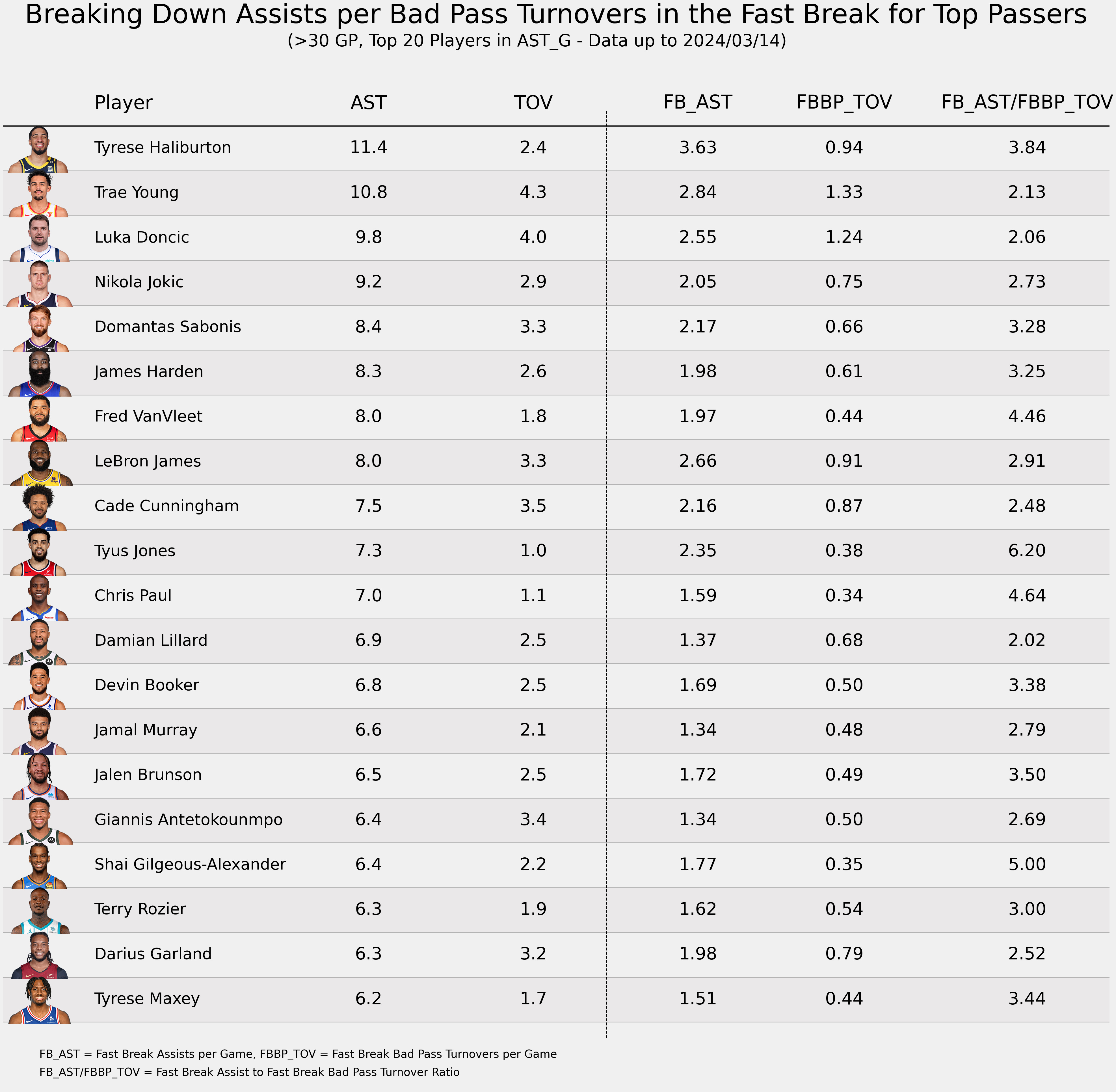
If you’ve watched the Pacers or just glanced at some pace stats, you won’t be surprised that Tyrese Haliburton has the most fast break/transition assists. The Pacers are experts at pushing the ball ahead and hitting early shots.
The team with an even faster pace than the Pacers is the Wizards - and Tyus Jones has a large share of his assists coming from fast breaks as well.
Overall, I don’t think this table is really useful since the context of what’s happening during a transition or fast break is probably the hardest to decipher with only shot and PBP data. You can’t decipher whether Jokić or Dončić made an assist by throwing an outlet pass or if they passed it to (for example) Gordon/Green on their half who then marched down the court and dunked it down. Those two types of passes and assists are monumentally different - both in the impact of the pass and the difficulty of it.
The same thing goes for bad passes, as there is a huge difference between throwing a bad pass during a 4-on-3 transition or throwing an inaccurate outlet pass that leads to a lower-scoring opportunity on the next possession.
Let’s focus now on the other part of the game - the half-court offense.
Half-Court Creators
While we still have little to no context around plays happening during the half-court offense, we can still get a better glimpse of each player’s passing style (and team style as well). In this section, I will try to explore those options.
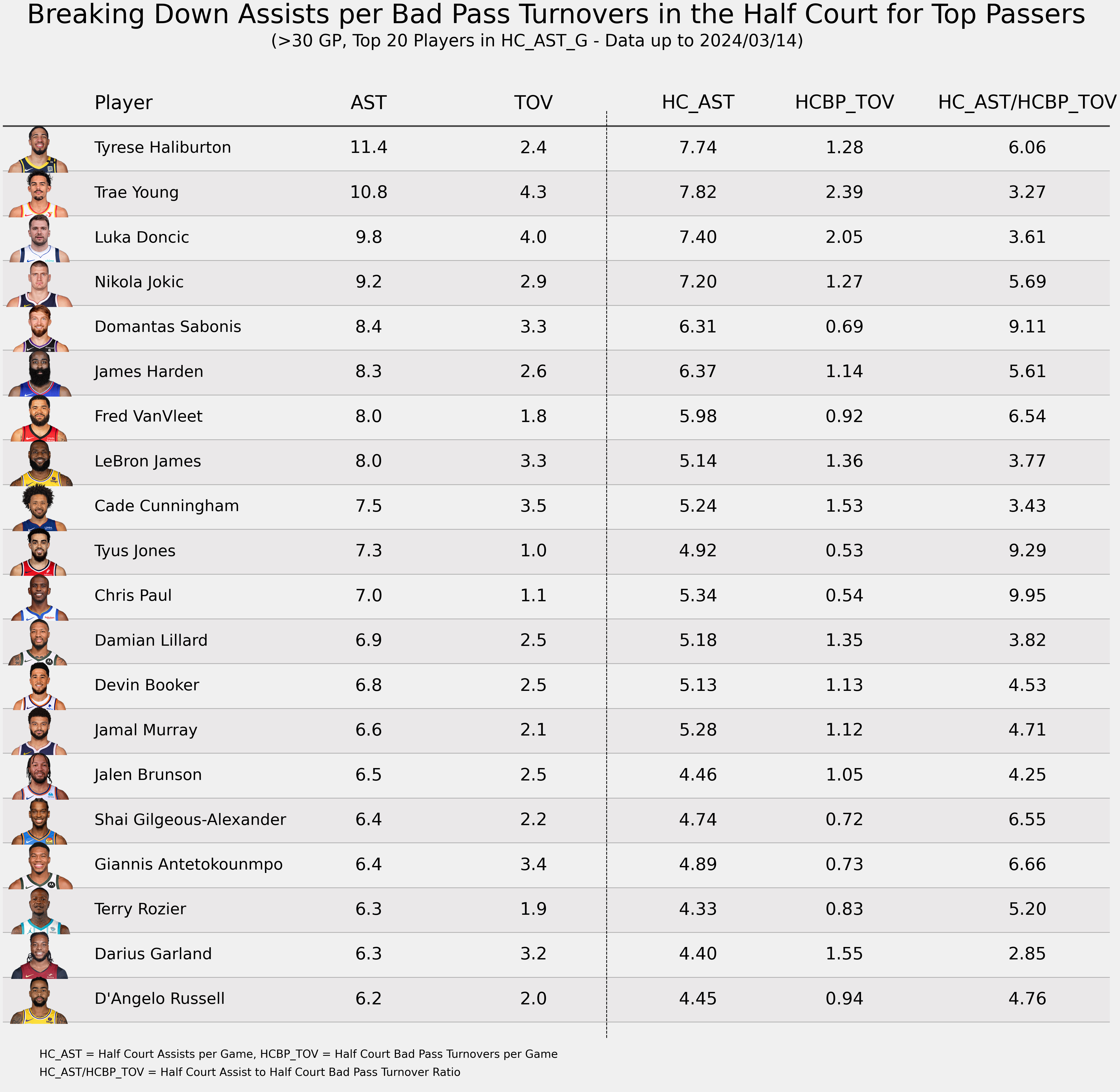
Trae Young becomes the leader in assists per game when we segment out only the halfcourt plays but the interesting part about this table is the jump that both Nikola Jokić and Jamal Murray make, maybe not in terms of overall spots moved upwards, but just the fact that almost 80% of their assists come in the half-court setting.
The other interesting thing is Domantas Sabonis’ even more efficient playmaking than it was when we observed all plays - I’ve touched on that in the first part as well - Sabonis has lots of dead ball turnovers and very few bad passes. We have already seen in the first part that Sabonis generates a lot of assists that require some work to score the basket after the pass (ie. the players Sabonis assists often drive to the hoop or pull up for a shot).
Distances of the Half-Court Assisted Shots
Let’s take a look at the previous statement from a different perspective to confirm or deny this statement. I think the easiest way to compare the distances across each player is to visualize it.
On this chart, you can then see the distances of shots made on the target player’s assists. The y-axis displays the share of the assists for a certain distance. The shots with the highest shot quality of course come right at the rim (layups and dunks) or behind the three-point line, so ideally you’d like to see three high peaks on this chart - one for the rim/restricted area (up until 5 feet), one for corner 3s (peak at 22 feet) and the final one at 24 feet and further.
Of course, the “3-peak distribution” is ideal only in theory, it is ridiculous to expect that there will be no shots in the paint or mid-range.
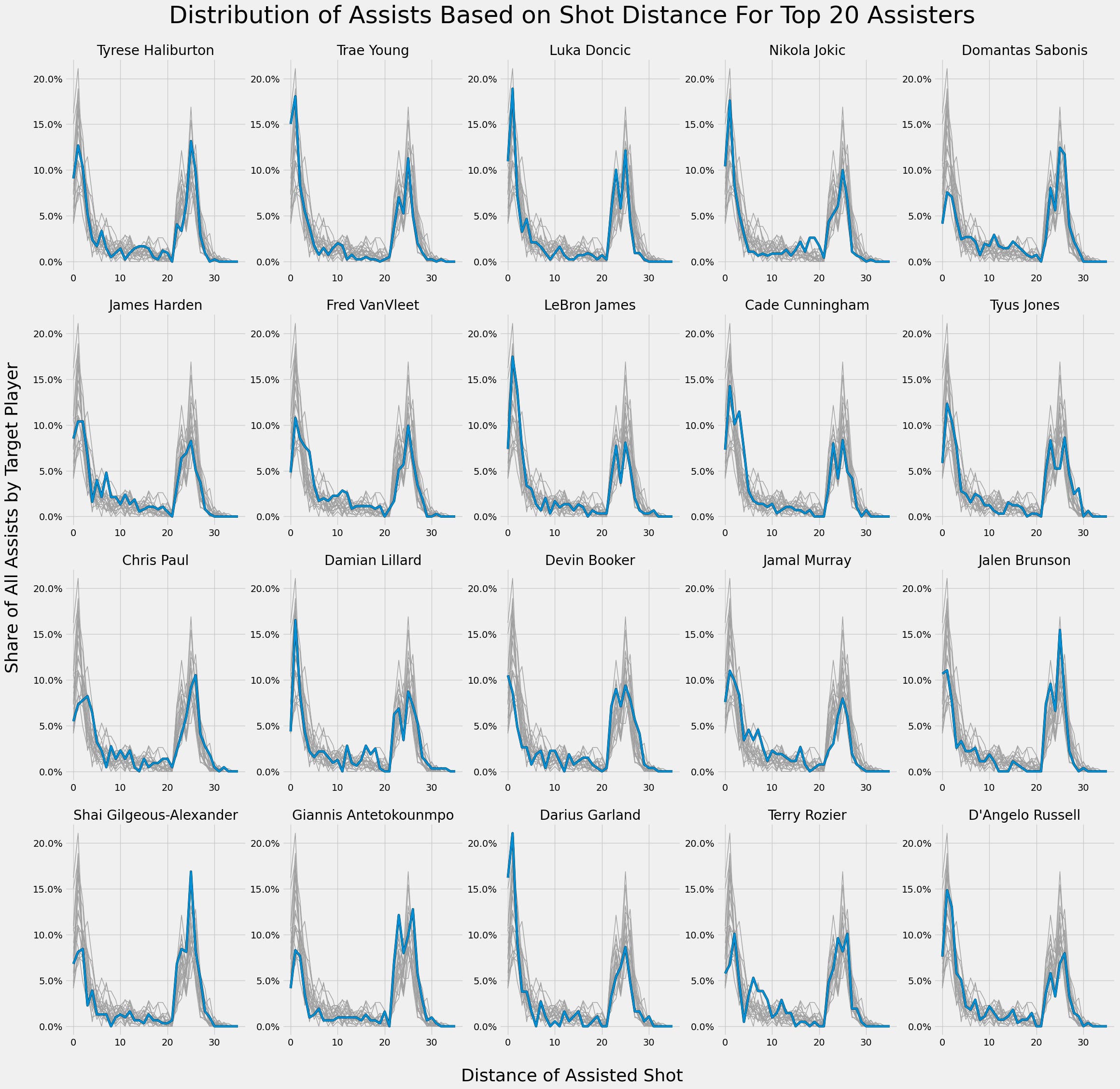
You can see on the chart that Sabonis doesn’t have a huge spike at the rim or inside the restricted area. He actually has the lowest share of assists inside the restricted area out of all players listed on this chart.
Some players manage to dish out easy dunks/layups right at the rim more than others - such as Darius Garland, Cade Cunningham, Luka Dončić, Nikola Jokić, Trae Young, and LeBron James... 50% out of all Garland’s assists come from inside the restricted area - that is an insanely high number and 4% more than the 2nd-placed Trae. Having two lob threats in Mobley and Allen helps him in that quest, but Garland is showing more razzle than Mitchell when attempting alley-oops and often threads the passing lines through some ridiculous angles.
Then you also have players who prefer to kick it out to the corner - Giannis Antetokounmpo being the one with the highest share of his assists on that 22-feet mark on the chart. That also makes sense given his skillset and the way the Bucks play - spread the floor, allow Giannis to attack through the pick and roll (in both rolls), and kick out when the paint/rim area isn’t clear. That also explains his low rim-assist numbers - it’s tough to dish the ball under the rim when no one is there.
Take a look now at the chart by Chris Paul - notice how he doesn’t have a big number of assists at the rim exactly. That is probably caused by possibly weird data recording at the Chase Center. More on that:

I think this is a very interesting chart overall, when you glance over some other profiles you can “read” out the playstyles by every team. Take Harden for example, notice a bunch of “short mid-range” shots - Kawhi and PG are great and curling inside the 3-point line and getting to their sweet spots. Look at VanVleet and his hilly short mid-range landscape - those are all of the floaters and hooks by Alperen Sengun. I’ll leave the remainder of the chart interpretation to your imagination ;)
What Next?
I’ve planned on diving into advanced stats and mixing them up with what I’ve come up with in these first two parts. Ideally, I’d like to extract a single metric with the results that I have for now. However, I’m not sure if I will play around with this in the next week or sometime in the future. If you have any questions or recommendations on this topic - happy to hear about them!