The NBA Arena Effect
On Frequency and Significance of Shot Location Lapses
Today I will write about a topic I hinted at a couple of days ago in my weekly chart dump post:
The Arena Effect isn’t a new topic/concept, Seth Partnow wrote about it a couple of years ago in The Athletic. Seth’s motivation behind his post came from the Wizards’ odd shot recording, where they’ve accidentally or purposefully recorded fewer shots inside the restricted area than there are. It appears that this issue didn’t stop then but persisted even more extreme in several different arenas.
The Bogus Restricted Area Walls
Unlike Seth, my motivation for looking into this data came from a Reddit thread highlighting some weird numbers regarding the Warriors’ number of shots inside the restricted area (for and against).
The scorekeeper (bear in mind that shot data is recorded by hand, not by tracking software) in the Chase Center indeed records the shots weirdly. So let’s dive right into the data.
The first chart shows a simple approach. We’ll look at the raw number of total attempts per game in the Restricted Area in Home vs Away games for each team, we instantly see a huge outlier in the form of the Golden State Warriors and Utah Jazz.
This instantly tells us that something is wrong with the shot data in the Chase Center and the Delta Center, but what about the Miami Heat? They are shooting and allowing only 40.42 shots at home and 44 shots on the road inside the RA. Their playstyle and tracking data confirm the shot data, as they are the bottom 5 in the league in shots per game that are closer than 10 feet (this data is tracked automatically). They often enter the paint offensively, but Bam Adebayo - their primary big man - often pulls up for fadeaway or turnaround shots outside of the restricted area.
But the Warriors and the Jazz are a different kind of story.
While this visualization isn’t beautiful per se, it is useful in delivering the point about the discrepancy of shot recording inside the Chase Center, the Delta Center, and even the Capital One Arena (Wizards’ Arena) - to a lesser degree.
The chart interpretation is simple, the Warriors (and their opponents) shoot 10% more shots in the paint (but outside of the RA) at home than when the Warriors play on the road. On the other hand, they (and their opponents) shoot -10.7% shots inside the Restricted Area when playing at home. Similar numbers can be seen for both the Jazz and the Wizards.
So to translate that to a common language - shots that should be in the restricted area, are being counted as outside of the restricted area when those teams play at home.
Notice how the Miami Heat is in the negative for both the RA and the “In The Paint (Non-RA)” zone - which makes their low numbers of RA shots non-anomaly.
And I haven’t yet talked about the opposite side of the spectrum, as several teams have a positive differential of RA shot frequency. The Knicks, the Cavs, and the Hawks are the ones that stand out there, and those teams indeed do have a problem as well, I’ll give an example for the Cavs in the later section.
Single Season Anomaly or Repeated Offense?
We’ll look at the chart similar to Seth’s in his post to check if the Jazz and the Warriors have this issue only in the current season.
This chart shows discrepancy only for the Restricted Area for each season since the 2013-14 season. We can see that the Warriors had an even bigger discrepancy in the past - last season was capped at a ridonculous -14.04%. The Wizards also had a major outlier in that 2020-21 season (during which Seth wrote his post) at -12.64%.
The largest positive outlier (in the entirety of the data) is this season’s Atlanta Hawks, but yet again they are only at +7.5%, and that might be maybe connected to their playstyle and poor transition defense in which they are 2nd to last.
This Chart is pretty chaotic, I tried to declutter it the best I could. It shows that the Warriors’ restricted area discrepancies have occurred in recent seasons, the same as in the Wizards arena. The Jazz are relatively consistent and just dipped in this season.
The positive teams mentioned earlier (Knicks, Hawks, Cavs) seem to have a one-off season where they’ve been steadily under 5% yet managed to leap over that mark this season.
Concrete Examples
I’m sure that most of you are now wondering how all this looks in practice, and I’m ready for that.
Last Thursday, February 22nd, 2024, the Lakers played against the Warriors, and that game gave us a perfect example of everything that was written up to now.
Here are two video clips of Austin Reaves seemingly laying the ball at the level of the rim, however, the shot data puts them just outside of the RA. But on these two following examples that are quite similar, the shots are marked inside the RA.
I nitpicked these two videos because Reaves jumped off a similar distance from the rim as in the plays versus the Warriors.
The plays from the Warriors game are both marked as outside of the RA and even though Reaves did jump far away from the hoop, he finished the layup basically at the rim. In the other two examples, Reaves launched from outside of the RA as well and released the ball inside of it, and that was marked correctly - or rather, more correctly - as I still have no idea how why the dunk shot isn’t marked at the rim, but the thing is that the shots actually finished inside of the restricted area.
Here’s an even starker example. In the GSW-DEN game just a couple of days ago, this shot was also marked outside of the restricted area even though KCP was comfortably inside it with one foot. So yeah, I think there is some bias in determining the location of shot data.
The Opposite Situation
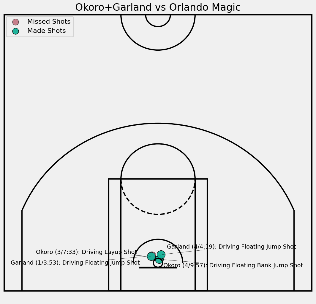
Let’s check what the opposite situation looks like, in the case of the Cavs. I’ll show an example from the game vs the Magic, that happened February 22nd.
Here are 4 plays where Okoro and Garland finished their drives outside the restricted area. In all 4 plays, they jumped more vertically instead of toward the rim, yet the location of their shots is a bit weird.
Somehow, the location of their shots is basically at the rim. I don’t know how that is possible since they are quite obviously outside of the RA. This shot chart is the complete opposite of the problems at the Chase Center, but equally problematic. The only positive thing is that it’s not happening on such a high volume.
Consequences of Data Discrepancy
The shot data is flawed, and when I started to dive into all of this, I immediately thought that the rim deterrence analysis I’ve made is thus also flawed.
When I crunched the on/off play-by-play data and combined it with shot data, it turned out that the Cavs are allowing more shots inside the restricted area when Allen and/or Mobley are on the court compared to when they’re off the court. With this new information, we could observe only away games to remove that shot data bias and check how the deterrence numbers come out with such a setup.
But it’s not only a deterrence metric, plenty of shot models, and overall models incorporate this data into the calculation.
There are several solutions to this problem. The easiest one to suggest is that there should be a standard for marking shot locations. Some people arenas mark the location of shots based on where jumps off, some mark them where a player approximately releases the ball (which is correct in my opinion), and some have a completely different vision of how this process should develop.
The better solution would be to automate this, and publicly share the locations resulting from tracking data. This may be wishful thinking, but it would be the most correct solution.


Good stuff. I've always wondered about why there isn't more uniformity regarding how scorekeepers track location; doing it by hand seems insane.